Luxury Endeavors
A private automotive concierge brand, taken from initial concept to a live production site by a single owner.
Premium positioning in a category that fights it
Luxury Endeavors is a private automotive concierge serving high-net-worth clients across four services: nationwide vehicle brokerage, concierge vehicle services in Frisco, TX and the surrounding area, nationwide transportation and logistics, and vehicle protection plans.
The positioning is deliberately relationship-driven, closer to a private bank or a luxury concierge service than to a dealership, a detailing shop, or a performance brand. That distinction is easy to state and hard to hold. Automotive sites default to loud reds, chrome, urgency banners, and financing language. Every one of those defaults would have undercut the brand.
- Category visual language: chrome, red, high-contrast urgency. Reads as volume retail, not private service.
- Protection plan copy drifts naturally toward warranty and financing lead-gen, which is the wrong register entirely.
- Four service lines, each with a different geographic footprint, nationwide vs. local, that had to stay straight site-wide.
- No existing brand system: no palette, no type scale, no components to build against.
Service copy could never read as a financing or warranty offer. “Flexible payment options” instead of “financing” is a small edit that carries the whole positioning: it keeps the page in the register of a concierge discussing arrangements rather than a lender presenting terms.
Not a “build the pages” engagement
Run end to end as the only person accountable for it: the phases below were sequenced, tracked, and delivered by one owner rather than handed between a strategist, a designer, and a developer.
- Scope & direction: translated business goals and service lines into a defined site architecture, working directly with the client.
- Project management: staged milestones across foundation, homepage, and service pages, with a single source of truth for open decisions.
- Design system: color tokens, type scale, spacing rhythm, and reusable components so pages scaled consistently instead of becoming one-offs.
- Brand & copy direction: set and enforced guardrails, including the financing-language rule and nationwide vs. local service consistency.
- Development: built in Next.js, with deployment pipeline, environment configuration, DNS, and transactional email.
- Client delivery: password-gated preview environment for review and iteration, then managed cutover to the production domain.
- Phase 1
Foundation
Luxury EndeavorsSite architecture, design tokens, and the component library, built before any page, so every page after it was assembly rather than invention.
- Phase 2
Homepage
Luxury EndeavorsBrand expression and the guided service entry point, establishing the editorial voice the service pages inherit.
- Phase 3
Service pages
Luxury EndeavorsBrokerage, concierge, transportation, and protection, each with its own copy guardrails and geographic scope.
- Phase 4
Preview to production
Luxury EndeavorsPassword-gated client review environment, iteration against feedback, then DNS cutover to the live domain.
A palette borrowed from hospitality, not horsepower
The core decision was restraint. An off-black on warm paper base, with a single champagne-gold accent carrying every call to action, and a deep navy reserved for contrast sections. No chrome, no red, no gradient. The palette reads closer to a private bank or a boutique hotel than to anything in the automotive category, which is exactly the borrowed credibility the positioning needed.

Type: editorial serif over neutral sans
- Cormorant Garamond: display headlines. A high-contrast editorial serif that signals considered rather than fast.
- Inter: body copy and UI. Neutral, highly legible, and deliberately unobtrusive so the serif does the brand work alone.
- The pairing reads premium without reading dated: the failure mode of most luxury serif choices is nostalgia, avoided here by keeping the sans thoroughly contemporary.
Components: built once, reused everywhere
- Buttons, forms, cards, and navigation defined as system components with tokenized color and spacing.
- Spacing rhythm and type scale fixed at the token layer, so page-level work never re-decided them.
- Result: four service pages that are visibly siblings, built as assembly rather than as four separate designs.
The system in production
The site is live at luxury-endeavors.com.
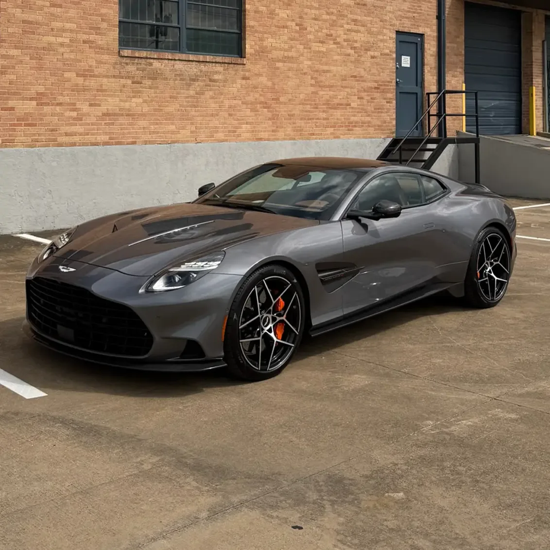 File photo Vehicle brokerage: featured vehicle image selected for the nationwide brokerage service page
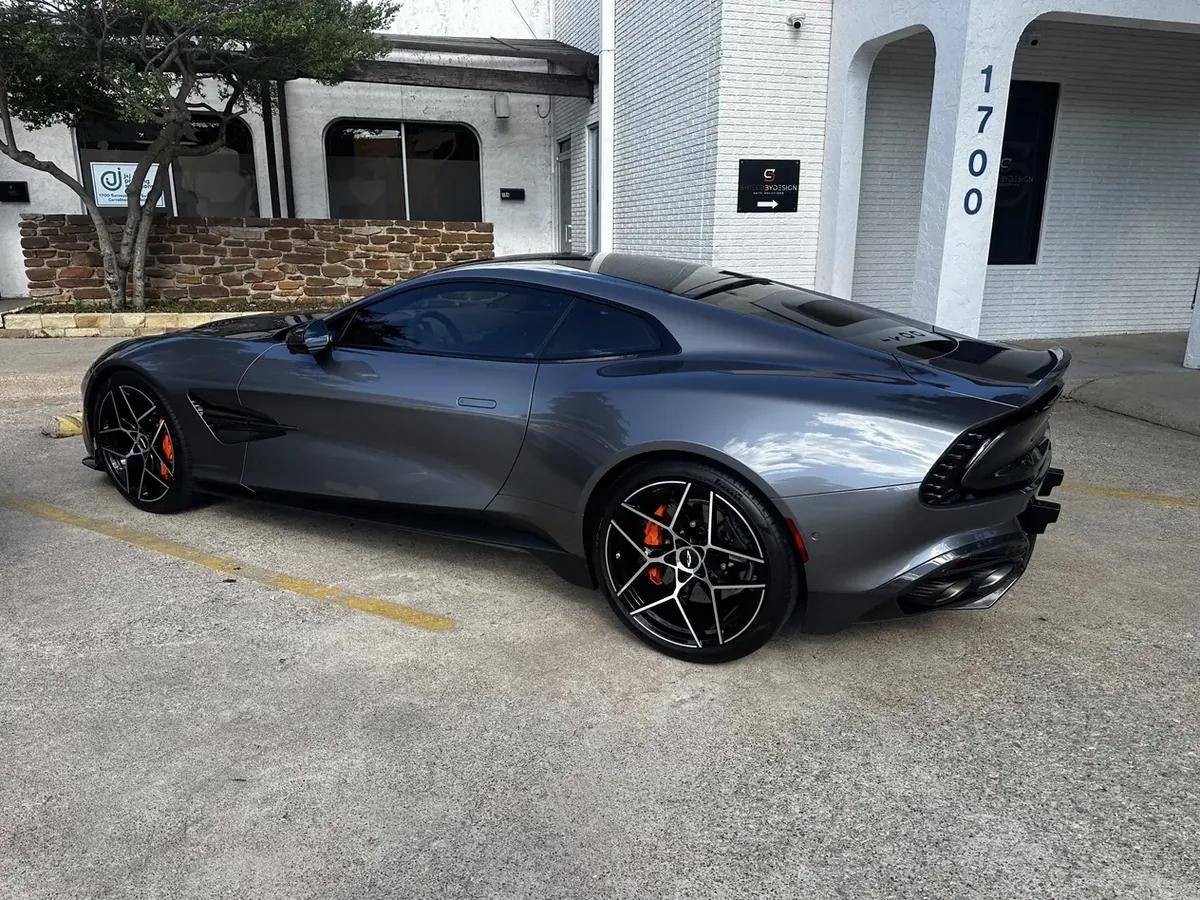 File photo Concierge vehicle services: paint protection film work, Frisco, TX area
AI across the whole build, not just the code
AI was part of the workflow at every stage. The useful distinction is that it accelerated production without being allowed to set direction: every output passed through a human review against brand guardrails before it shipped.
Claude Code and Claude Desktop to scaffold and edit the Next.js codebase, build components against the design system, and debug deployment issues.
A living CLAUDE.md at the repo root: brand rules, open items, decisions, keeping AI-assisted work consistent across sessions and devices.
Generated and documented the full token set and component library, turning brand direction into a build-ready spec rather than starting from a blank file.
Drafted and refined service page copy, then reviewed every line against guardrails: the financing-language rule caught cases AI drafting reintroduced.
AI-assisted concepting to explore logo and monogram directions and palette options before finalizing production assets.
Diagnosed issues like image cropping inconsistencies across service pages, and weighed solution paths before committing to an implementation.
The repo-root project brief did more work than any single prompt. Brand rules, open decisions, and constraints written down once meant every subsequent session started from the same understanding, which is what kept a solo build across multiple phases and devices from drifting into inconsistency.
Shipped, not staged
A client review environment, then a clean cutover
Client review ran against a password-gated preview deployment rather than screenshots or a staging link passed around informally. That let the client evaluate the real thing: actual type rendering, actual interaction, actual mobile behavior, and iterate against it before anything was public.
The production cutover was then a managed step rather than a launch event: DNS, environment configuration, and transactional email verified in sequence, with the preview environment remaining available as the reference point throughout.
A fully built, launch-ready site: brand system, copy, and code. Delivered with a single owner accountable from initial scope through final deployment.
The deliverable that matters most isn't the page count. It's that the design system underneath it means the next service line is a day of assembly, not another project.